Equipment rental is a very competitive space, so it’s essential to establish and maintain a strong online presence for your rental equipment business.
Your first step in reaching a wider audience is to create an efficient easy-to-use website.
For building a site, you’ll find a bunch of different options out there that can be adapted for equipment rental. Some rental companies use Shopify for their sites, while others use WordPress with ecommerce plugins like Magento.
With these platforms, however, you may have trouble finding a good template that’s actually designed specifically with equipment rental in mind. While you can adapt other templates designed for ecommerce, rentals have their own unique needs and considerations that a generic online retail template won’t always cover.
Quipli’s site builder comes pre-equipped with a professionally designed template built specifically to meet your rental customers’ needs. Created by industry experts, it’s optimized for an excellent user experience and crafted with customer conversion in mind.
Using an option like Quipli’s site builder that’s custom-tailored to your business will save you time and money, as the template comes pre-loaded with industry-specific features.
A good template should be built with rental businesses in mind
When you choose a template for your rental business website, you’ll need one that’s designed with companies like yours in mind.
A good template for a rental business will have intuitive navigation options that streamline the checkout process, as well as a rental-focused structure and layout that sets the foundation for an incredibly efficient customer-friendly website.
How much do equipment rental website templates usually cost?
The cost of equipment rental website templates can vary depending on the tools you use to build your site. Different website builders and content management systems offer their own selections of both free and paid templates, each with its own pricing structure.
Let’s take a look at the pricing for some of the most popular options.
Quipli’s Rental Website Builder
Quipli’s customizable template is expertly designed specifically for equipment rental businesses. It has everything you need to start taking orders and making sales online.
Some of the important features you’ll get with Quipli’s site builder include:
- One-click page composer. Need to create a new page? All you need are a couple of clicks.
- End-to-end ecommerce integration. Everything you need for customers to book rentals and make payments online is already built in.
- CRM integration. In any kind of retail, including rentals, your customer relationship management (CRM) software is an indispensable sales tool. Quipli’s site builder and template are set up to integrate with Quipli’s CRM features.
- Easy-to-use blog features. Adding new blog posts is simple with Quipli.
- Tech support. Having issues with your site? Quipli includes robust tech support via phone or chat to get things up and running again.
WordPress, Shopify, & Other CMS Platforms
If your equipment rental website is built on another content management system like WordPress or Shopify, you may need to consider buying a suitable template separately.
While some platforms may have free templates available, you’re not likely to find a free one that’s specifically for equipment rentals. Premium templates usually fall within the price range of $20 to $60. For a niche business like equipment rental, most templates you’re going to find will be premium priced third party templates.
The cost of the template doesn’t necessarily equate to its quality, and you won’t need to spend a ton of money to get what you need. There are many low-priced templates that provide excellent features and capabilities that can meet or exceed the needs of your rental business without crushing your budget.
Choose a template that syncs up well with your budget and your business goals. You can choose Quipli’s free template, or go with a premium option built with WordPress or another CMS.
Either way, investing in a well-designed equipment rental website template is definitely an important step in establishing a strong online presence for your rental business.
What should an equipment rental website template include?
A high-quality template can help make it a lot easier to work with and modify your website, making things easier on you and your dev team.
It also comes with features that can go a long way toward creating a great user experience for customers who visit your site, helping you get more bookings.
When setting up a website for your equipment rental business, it’s best to use a template designed specifically for the rental industry. These tailored templates come with features that meet the unique needs of rental companies.
For example, they may have easy-to-navigate categories for browsing equipment, secure checkout processes for rentals, and other functionality made for managing rentals. An industry-specific template can save you a lot of time and effort during the website setup process, since the foundation is already laid for many rental-specific elements. Rather than building those rental features from scratch, you can start with a template that’s already optimized for equipment rentals.
There are certain features and pages that any equipment rental website absolutely needs. Any template you use should include these types of pages by default, and make it simple to set them up and format them.
- Home page
- Product pages
- Category pages
- Checkout page
- Location pages
Home Page
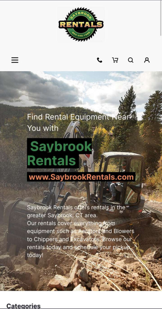

The home page serves as the first point of contact for visitors to your website. It should be visually appealing and provide an overview of your rental business. The home page should feature clear calls-to-action, guiding users to explore your rental offerings and easily find the equipment they need for their projects.
Every website needs a home page. It’s like the front door to your equipment rental business – it’s the first thing visitors see and makes that all-important first impression. The goal is to quickly communicate who you are, what you rent, and why customers should choose you.
For homepage content, keep it simple and focus on introducing your rental specialty – whether that’s construction tools, event supplies, industrial machines, or another type of equipment. Help visitors immediately see if you offer the types of rentals they need.
A good home page also gives a snapshot of your business, values, and offerings, with links to key info like your top products or special deals.
Your home page should be simple, and straightforward, and make it easy for users to navigate to exactly the types of products they’re looking for. When people land on it, they should instantly get a feel for your brand and what solutions you provide equipment renters. Useful, engaging content and strategic links make it easy for them to explore and find what they need.
A clean, clutter-free layout and a prominent search bar will help them zero in on products efficiently. Good navigation enhances the experience and keeps them on your site longer.
Share a brief, compelling message explaining your commitment to customers and passion for the rental industry. Combine it with eye-catching photos of popular rentals to capture interest. This combo introduces your mission while encouraging visitors to learn more.
Featuring strategic links prominently can help guide visitors to important pages, like limited-time sales or seasonal deals. Use attention-grabbing CTAs that lead them to offers they won’t want to miss. This can help spark interest and inspire customers to explore your rental selection.
Also, be sure to give visitors easy access to your contact information. Letting them quickly get in touch with questions builds trust and shows you’re committed to great service. Offering multiple ways to reach you—phone, email, live chat—makes customers feel confident you’ll be responsive to their needs.
The bottom line is that your homepage makes that all-important first impression on visitors. Use it to highlight your expertise, inventory, and commitment to customers. With the right mix of helpful content, easy navigation, and service-focused features, you can convert those visitors into repeat renters.
Your home page is your storefront—make it shine!
Prominent Call-to-Action
Place a clear and compelling call-to-action (CTA) on the home page to encourage visitors to explore your rental offerings. An effective CTA can significantly increase conversion rates.
Featured Products
Highlight a selection of your most popular or new rental products directly on the home page. This entices visitors to learn more about these offerings and drives engagement.
Contact Information
Ensure that your contact information, such as a phone number and email address, is easily accessible on the home page. A visible contact section instills confidence in potential customers, knowing they can reach out for inquiries or assistance.
In addition to a “Contact Us” page with a contact form, you can also list your contact information throughout your website, in the footer at the bottom of the page.
Product Pages
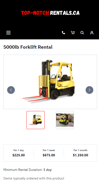

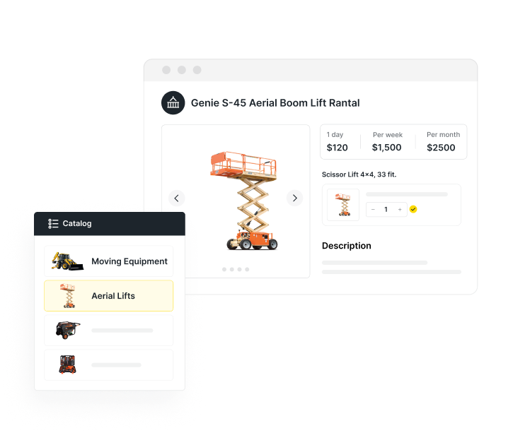
The individual product pages are where the magic happens – showcasing the details of each equipment item available for rent. Ensure that the template provides a clean and organized layout for presenting informative product descriptions, high-quality images, and rental options.
For any equipment rental website, the product pages are where the rubber really meets the road. This is where curious visitors come to dive deep into the details of each and every rental item you offer. They’ll pore over the descriptions, specs, rates, and photos to understand exactly what they’d be getting if they book with you.
These pages allow customers to truly kick the tires before pulling the trigger. That’s why it’s mission-critical that you put care into crafting compelling, information-rich product pages that turn those casual visitors into confident renters.
Take the time to highlight the benefits and value of each piece of equipment for the customer. Go beyond dry specs and help them envision themselves renting and operating your equipment for their next project. The goal is to provide such an outstanding preview that the decision to book becomes a no-brainer.
When you put in the effort to optimize these pages, you’ll reap the rewards with higher conversion rates and repeat business.
A good rental business template is essential for creating effective product listings that convert
Making sure you have product pages set up properly is another reason to opt for templates designed specifically for online rentals – or at the very least for ecommerce.
When setting up product pages, equipment rental templates tailor-made for online bookings are the way to go. Unlike generic templates, they come pre-loaded with all the features needed to optimize showcasing your rentals and completing transactions.
This means built-in tools for galleries, pricing calculators, streamlined booking, and more – things that would take ages to build from scratch. The right specialty template handles the heavy lifting so you can focus on making those pages shine with compelling descriptions, tiered pricing tables, videos, and dazzling photos to hook customers.
Essentially, rental-specific templates give you a head start on creating a stellar online storefront that attracts and converts renters. The effort and time savings then translate into more bookings and revenue for your business.
What should product pages include?
There are a couple of key elements that all of your product pages need to include:
- Informative product descriptions
- High-quality product images
- Clear, easy-to-find options for purchase/checkout
A good template makes it easy to add and modify these key elements to each page.
Informative product descriptions
Don’t slack on descriptions – quality write-ups really help customers understand what they’d be getting with each rental. Provide plenty of clear details on features, specs, and benefits. Address common questions upfront. And showcase what makes the item special – this helps turn browsers into confident bookers.
High quality images of the product
Let’s be real – eye-catching photos and videos are total game-changers when someone’s deciding what to rent. Make sure to include lots of crisp, high-res images showing off your equipment from all angles. Let customers see the item in action. Give them a virtual demo experience! Quality visuals build trust and help renters visualize precisely how your gear can meet their needs for a project. Plus, vivid footage is way more persuasive than words alone when you want to clinch the booking. So invest time staging and capturing stellar pictures and video that make your inventory shine. It’ll be well worth it in higher conversions.
Clear, easy-to-find options for purchase and checkout
Make renting a total breeze by having obvious buttons right on the page for adding items to the cart or starting checkout. Big, clear “Rent Now” buttons let customers book fast with no hassle. Streamlining the process means more rentals in your pocket.
Also, think about letting customers customize or add accessories for rentals right on the product page. You may have some optional upsells that you can offer during the checkout process, like different-sized attachments or extra power packs. This personal touch amps up their experience and the total rental value.
Bottom line – load your pages with all the key details and tools to empower visitors to book their perfect rental package, hassle-free.
Category Pages
Product pages are organized into categories, and each category gets its own page that links out to each relevant product – making it easy for customers to see all of your related offerings at a glance.
Any kind of ecommerce site – including equipment rentals – benefits immensely from having a well-planned system of category pages. Category pages really form the backbone of any equipment rental website. They take all your inventory and break it down into intuitive groups so customers can easily browse rentals. Putting real thought into these pages can seriously improve how visitors experience your site.
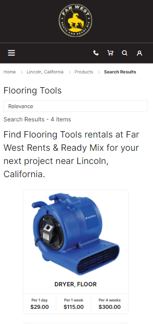
Each category page gathers up equipment that’s similar—like “Lifts” or “Air Tools.” This lets someone quickly zoom in on the types of rentals they need for the job. Carefully curating categories tailored to your offerings ensures folks can find the perfect item fast.
You can even nest categories to create a hierarchy from high-level groups down to super-specific equipment types. This multi-level structure streamlines browsing by guiding users from broad categories down to niche rentals. It simplifies the selection process for them.
Now here’s a cool benefit – category pages are amazing for SEO! They show search engines a clear structure of your content. Well-organized pages signal to Google the exact topics your site covers, boosting your rankings. More visibility means more rental customers headed your way.
But don’t just list products on category pages. Sprinkle in helpful info like FAQs, buying guides, and tips for that equipment type. This extra content helps customers make smart rental decisions. It also shows your biz knows these products inside out.
The bottom line? Sturdy category pages organize your rentals while helping visitors find what they need. Take time to tailor categories to your inventory and include bonus content where you can. This approach keeps site visitors engaged and converts them into thrilled renters.
Checkout Page
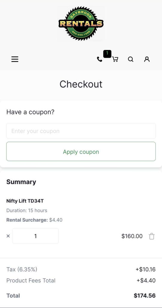

The checkout page is the final stage of the rental process, where customers complete their transactions and secure their chosen rental items. A well-designed and user-friendly checkout page is essential for ensuring a smooth and hassle-free rental experience.
Most ecommerce site templates, including those designed for equipment rental, will include secure checkout features. Security is of paramount importance during online transactions, especially when it involves sensitive information like payment details.
Reputable ecommerce templates incorporate robust security measures, such as SSL encryption, to safeguard customer data and instill confidence in the rental process.
Here are a few tips for creating a streamlined, user-friendly checkout process.
Allow guest checkout, even when your site has an option for users to create accounts.
Some customers may prefer a quick and straightforward checkout process without the need to create an account. By providing a guest checkout option, you cater to the needs of all customers, whether they are returning clients or first-time renters.
Display progress indicators during the checkout process, so the customer knows which step they’re on.
A clear and visible progress indicator keeps customers informed about the stages of the checkout process. This feature eliminates confusion and helps customers understand how much more information they need to provide before completing their rental order.
Offer one-click checkout as an option.
Streamlining the checkout process with one-click options, such as saved payment methods or shipping addresses, significantly reduces the time and effort required for returning customers to complete their rental transactions. This convenience encourages repeat business and fosters customer loyalty.
Include a Shopping Cart page feature for multi-item purchases.
A shopping cart allows customers to review and modify their selected rental items before proceeding to checkout. This feature is especially valuable for customers who are renting multiple pieces of equipment for a project, as it ensures accuracy and reduces the risk of any unintended duplicate rentals.
Be upfront about things like taxes and extra fees, and make these surcharges visible and known to the customer as early as possible in the checkout process.
Transparency is key to building trust with customers. Clearly displaying any additional costs, such as taxes, insurance fees, or delivery charges, during the checkout process prevents surprises and establishes a positive customer experience.
Allow smart form filling to speed up the checkout process for customers.
Implementing smart form-filling capabilities, such as autofill or dropdown menus, can save customers time and effort when entering their contact and payment information. This feature enhances user convenience and encourages a seamless checkout journey.
By implementing these best practices on your checkout page, you can optimize the rental transaction process and enhance customer satisfaction. A smooth and secure checkout experience contributes to the overall success of your equipment rental website, encouraging repeat business and positive word-of-mouth referrals.
Location Pages
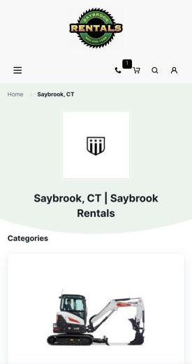

If your rental company serves more than one nearby area – such as different towns or counties, or even different named neighborhoods in larger metro areas – you should also create a dedicated landing page for each location that you serve.
Creating separate location pages for each market you serve just makes sense if you want to connect with local customers. These pages are perfect for ranking high in Google searches for things like “forklift rental near me.”
For example, if you operate in multiple cities in Michigan, you can give your Detroit shop its own page customized for Motor City renters. In the page content, you can show off the inventory at that branch, list specials for Detroit residents, highlight testimonials from local customers, and more. Do the same for your other locations too.
This gives each region you operate in a home base on your site. Now Bob in Detroit isn’t searching through rentals in Minneapolis or Anne Arbor. He finds equipment and deals tailored to him. Catering to each specific area drives more local bookings and loyalty. It’s a simple move that goes a long way.
One of the key benefits of location pages is that they’re great for equipment rental SEO. These pages signal to Google which markets/areas you serve, helping you rank for local and “near me” searches in each location.
SEO is huge for getting your site seen by people searching for rentals in your areas. That’s where dedicated location pages shine. They let you pack each one with keywords, content, and biz info tailored to that specific zone.
So your Austin page can have Austin-specific keywords, details on serving that city, etc. This tells Google “Hey, we’re THE go-to rental shop for Austin!” And that means when someone searches for rental equipment in ATX, your page will come out on top.
The more you can optimize each location page for its local customers, the more search traffic and bookings you’ll hook from each region. That’s a pretty sweet payoff for creating some targeted pages!
Build your perfect rental business website with Quipli’s powerful templates
Looking to easily create an awesome rental website? Look no further than Quipli’s templated website platform, made just for equipment companies like yours.
Quipli’s powerful site builder makes it super simple to showcase your inventory and optimize booking in a few clicks.
The user-friendly customizable rental site template comes loaded with all the right tools for managing online rentals – from automated inventory management to streamlined rental booking & scheduling. Whether you’re already renting or just getting started, Quipli has your back. Their specialty templates help you create a slick, pro-level site that reels in renters.
So skip the hassle and partner with Quipli to launch the perfect online home for your equipment rental business today!
